Anne of Green Gables Book Design

Lucy Maud Montgomery’s legacy lives on through her wonderful coming-of-age tale “Anne of Green Gables”. I fell in love with the story and with the character Anne immediately and knew I needed to modernize the book design. I wanted to create something that would be considered old today but with modern tools. My approach resulted in this surrealist style capturing Anne’s imagination and wonder.
Overview
Design Plot
Full Book Illustration
Jacket and Softcover Design
Interior Type Design/Setting
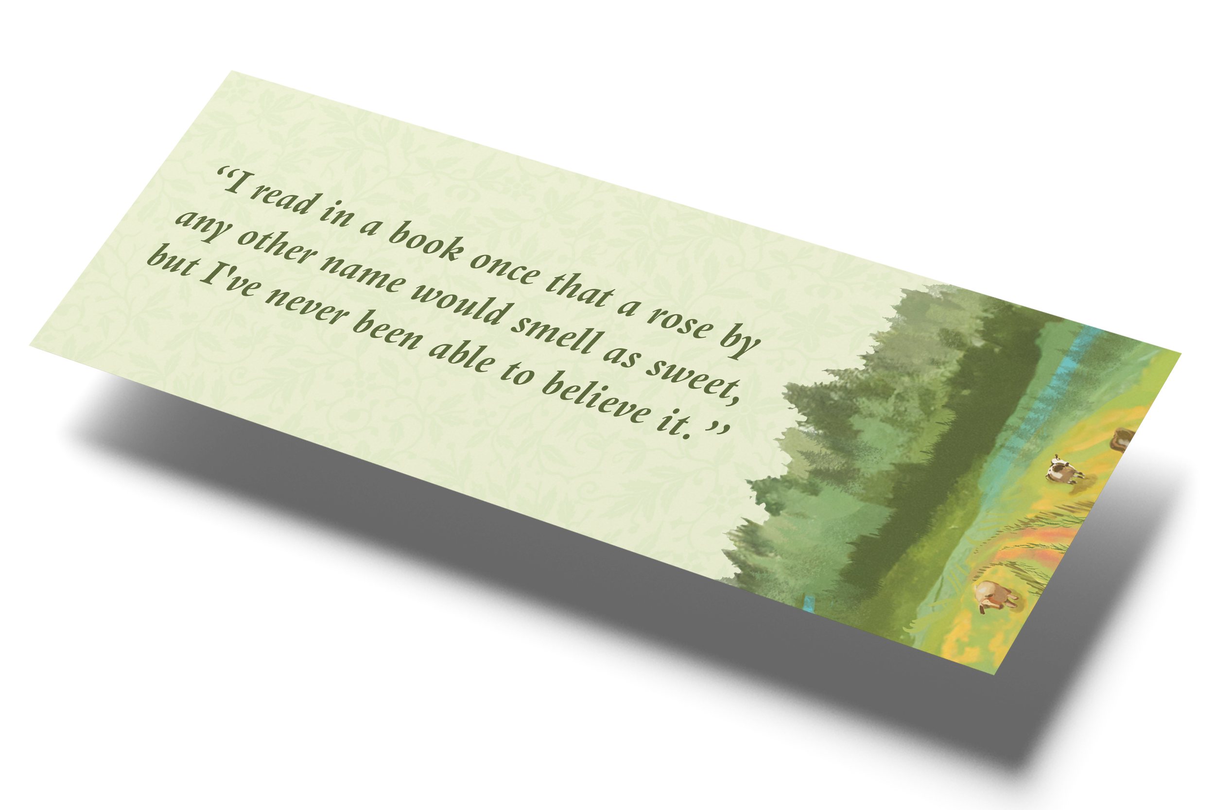
Rose Bud Symbolism
As a symbol of innocence, purity, and passion, the rosebud was the perfect object to represent Anne’s personality. Taking it further I illustrated a depiction of the actual “Green Gables” tourist site on Prince Edward Island. The goal was to show that the rosebud, representing Anne, surrounds and protects Green Gables. Anne’s presence enriched the Cutherburt’s lives turning a house into a home.

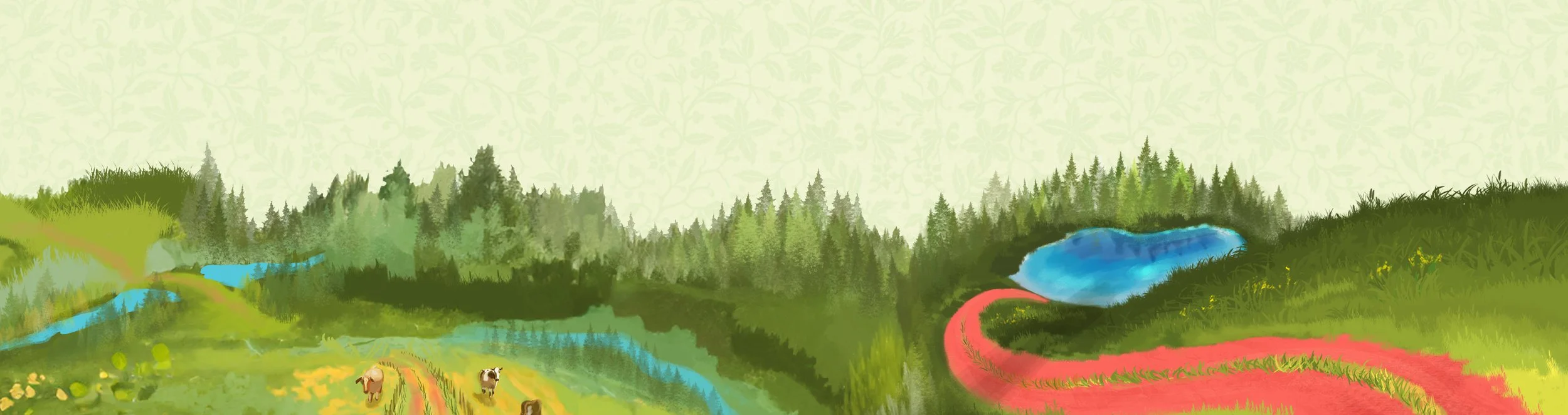
Surrealistic Style
The surrealist illustration style was a deliberate decision and a nod to Anne’s large scope of imagination. When you look at the illustration, you see the world through Anne’s eyes. She finds the beauty in everything by using her overactive mind as the catalyst for kindness and positivity. I wanted the audience to feel that sense of wonder looking at my surrealistic art style.

Dust Jacket Design

Soft Cover Design

Formatting Details
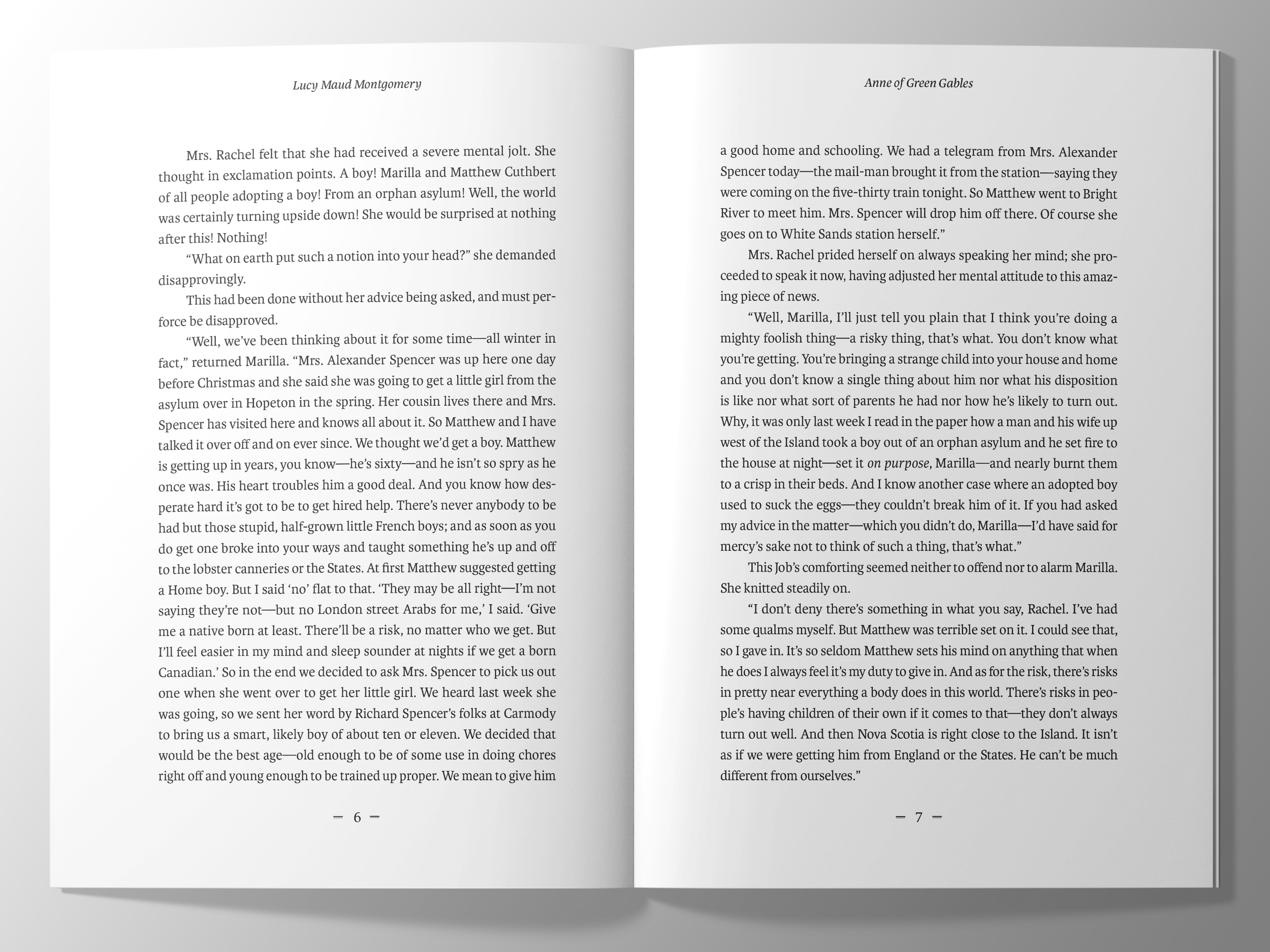
Main Text
○ Typeface: Karmina
○ Type size and Leading: 11/16
○ Average Measure Characters: 66
Display Type
○ Typeface: Atocha
○ Type size and Leading: 15/16
Page Size & Shape
○ 6” by 9”
○ Gutter: 0.6875
○ Head: 0.8889 in
○ Fore-edge: 0.9375 in
○ Foot: 1.2222 in
Running Content
○ Eskorte Latin
● Folios: 11/16
● Running head: 9.5/16
Typography Audit

Body Copy
For the body typeface, I chose Karmina because I believe it ennobles the text of “Anne of Green Gables” by delivering a font that expresses the pensive tone of the story. In other words, the chosen font allows for the story's inquisitive nature to shine. It provides a subliminal connection to Anne’s brain.
-
Karmina was created by a woman and Anne of Green Gable's story motifs align with women's empowerment and equality. As a woman, Anne struggled to be considered an equal compared to what the Cuthberts wanted, which was a young boy. The font I chose reflects that women can create something that is just as good, if not better than what men can do. It's almost as if Karmina honors who Anne is as a character. (i.e., her charismatic charm, her unruly intelligence, and her fantastical view on life.)

Display Font
The chosen display font has a lighthearted and exploratory nature, emphasizing Anne’s freedom and spontaneity. It also incorporates elements of nature, to which Anne has a strong connection.
-
For the display type, my goal was to allow the audience to delve into the inner workings of Anne’s mind, as she is the main character of the story. With this concept in mind, I selected a whimsical yet sophisticated display font that captures Anne's true personality. Since Anne is a daydreamer at heart and remarkably intelligent for her age, I thought a font like “Atocha” was perfect to capture both aspects of her personality.