Guitar World Digital Magazine

Overview
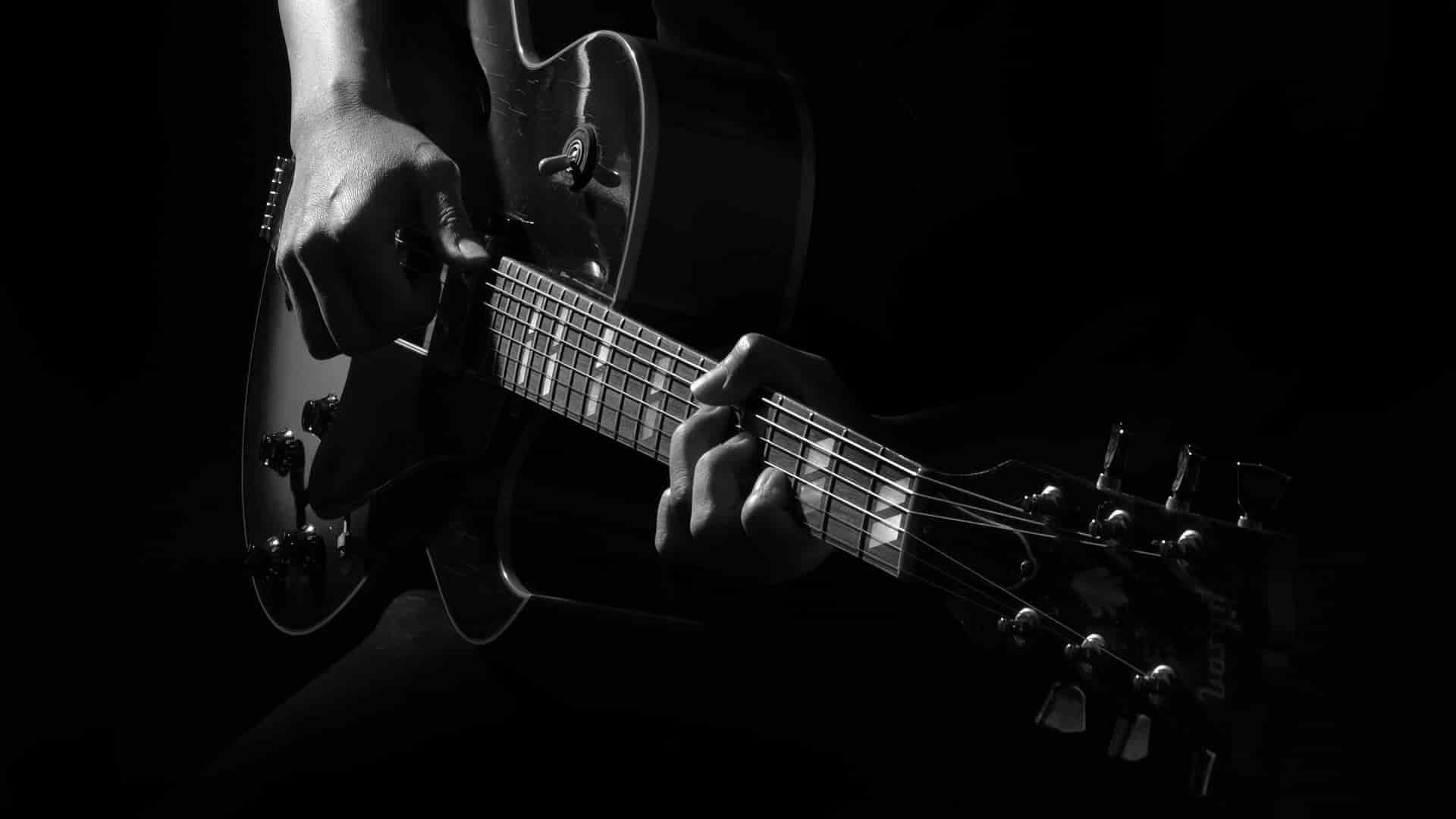
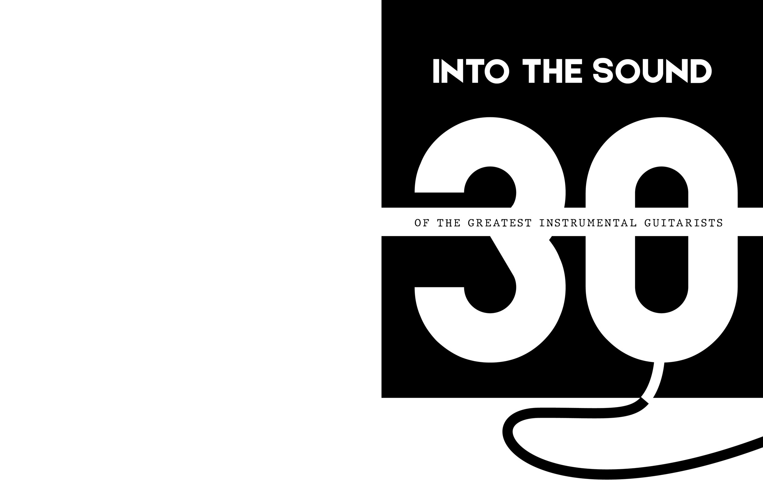
Instrumental guitarists deserve the spotlight. They create narratives and deep connections with their fingers and guitar strings, all without the need for vocals. This genre of music nurtures a profound bond between guitarist and guitar, a connection that inspired me to represent through design. Amit Smith from Guitar World wrote an article titled, “30 Instrumental Guitarists with Something to Say”. I then took this article and created a physical magazine feature that presents each guitarist in a unique light.
Narrative Content
Image Selection
Designing the Spreads
Design Plot
Digital Magazine Flipbook
The Intro Spreads
To introduce the feature in an engaging way, I present my concept of connection with the music by creating an amp and a cord that travels through the first two spreads. This guides the reader along the line and introduces them to the premise of the article.

Typography Audit

Body Copy
Brandon Grotesque Regular 11/14: Used across all body copy.
-
Drawing inspiration from geometric sans serif fonts, this typeface balances friendliness with seriousness while maintaining readability at all sizes. Its small x-height adds a personal touch, making it ideal for conveying the intimate connection between guitarists and their instruments

Display Font 1
Etna: Used for the guitarists names
-
Inspired by Mount Etna itself, this font has a bold and sharp appearance. It features an aesthetic that feels strong and in-your-face, almost as if the font itself became an onomatopoeia. Additionally, it has electric sharp edges that are akin to rock and other electric guitar-featured genres. With these notions in mind, I use the font to represent the names of each artist to establish a clear typographic hierarchy and to emphasize that they have made a name for themselves.
Display Font 2
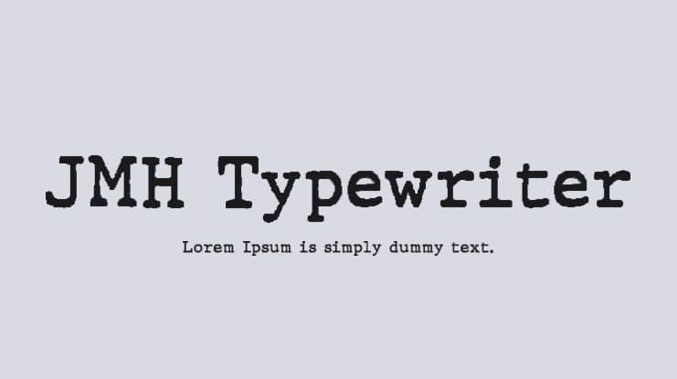
JMH Typewriter: Used when displaying each guitarist’s nickname or identity
-
Typewriter fonts, a longstanding default choice, carry significance beyond mere tradition. Consider the tactile relationship one forms with a keyboard or physical typewriter – the rhythmic glide of fingers across keys mirrors a guitarist's touch on strings. This analogy underscores the essence behind typewriter fonts; they visually embody the hand-eye coordination and profound connection essential for mastering any craft, akin to the artistry of musicians.


Photo and Text Credit
The body copy is an abridged version of the work of Amit Sharma of Guitar World. You can find the original article here
Furthermore, I assert no ownership over any of the photos used; they were taken strictly for educational purposes. Below is a list of all the amazing photographers and the guitarists they photographed. Note that photos not mentioned are part of the associated press and are protected under fair use.
Joe Satriani: Guitar World
Nick Johnston: Guitar Interactive Magazine
Steve Vai: Medios y Media/Getty Images
Gutherie Govem: Stirling Elmendorf
Yvette Young: Lily Pearl McLaughlin Photography
Plini: Pickup Music
Julian Lage: The Gazette
Mateus Asato: Shelby Stiefel
Polyphia: Ibanez
Mark Lettieri: Prsguitars
Matteo Mancuso: Pietro Parrinello
Mike Daws: Daddario
Lari Basilio: Juarez Rodrigues
Andy Timmons: Dimarzio
Greg Howe: Fred Morledge
Friers and Kennedy: Getty Images
Angel Vivaldi: Andrew Minarik
Marcos Mena: Fecking Bahamas
John Mclaughlin: Guitar.com