ART FOR THE WORLD


Art for the World, an NGO promoting the spread of art to reach communities across the world, is undergoing a revamp. After conducting research and analysis, I found their marketing to be outdated and lacking in effective communication. My goal was to redesign the company entirely from the ground up, recreating both their mission and their brand for clarity and effectiveness. Now, the new and improved non-profit has found a home on school buses, emphasizing how they are a company on wheels.
Overview
Design Plot
Restructured Mission
New Logo and Brand
Promotion and Merchanis
Fan Merchandising
Original

My Redesign

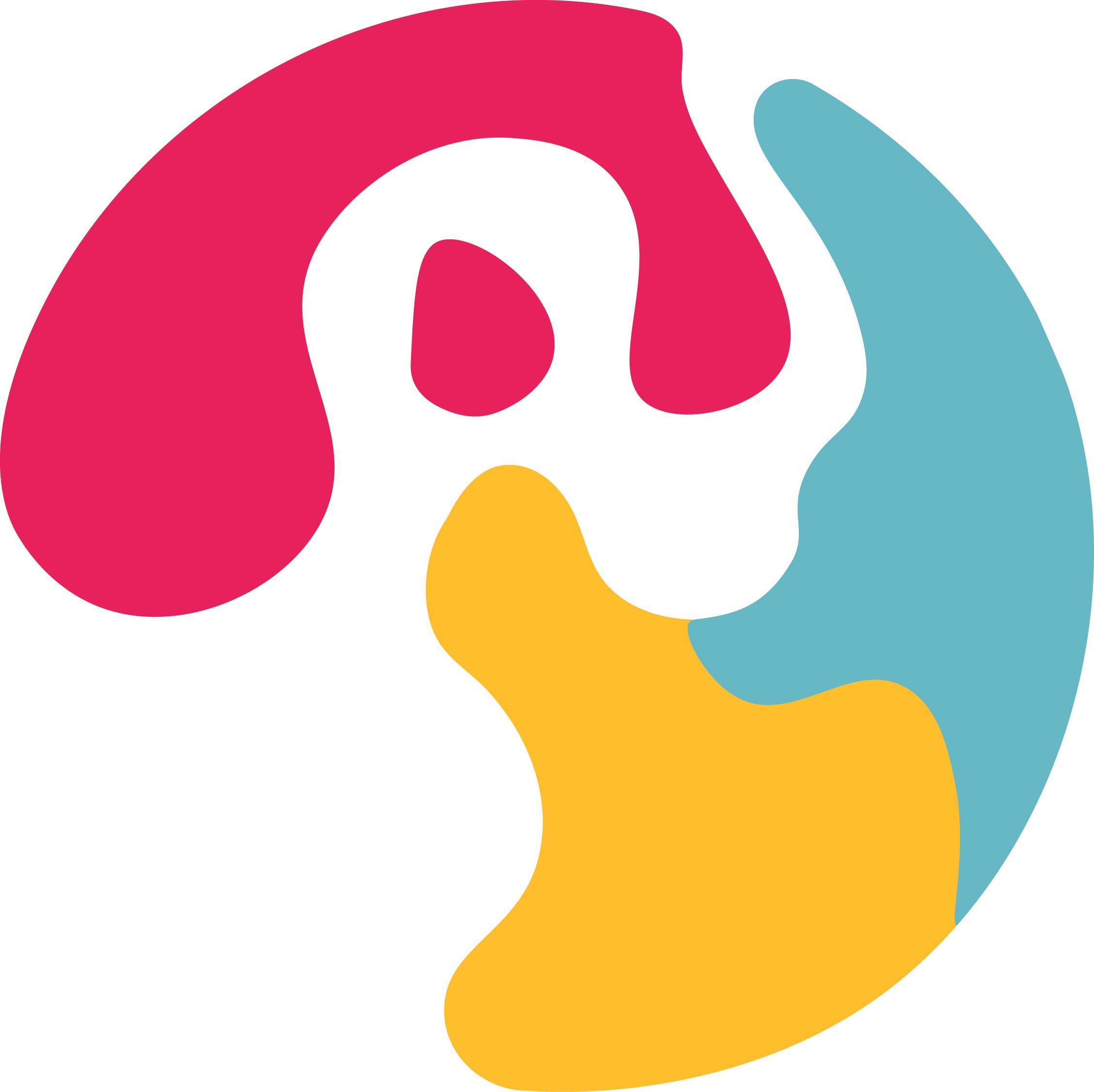
Palette
The painter’s palette is a universal symbol for art. Most countries have a paint palette in some form.
+
World
Abstracted continents as paint splotches on the palette emphasizes the NGO’s global outreach
+
Letter “A”
The Lettermark “A” hidden in the center of the logo is used for quick recognition of the brand.
Rich Magenta
Chrome Sands
Sky Blue

HEX: #ffbe2c
CMYK: 0%, 28%, 92%, 0%
Font Choice
HEX: #e7215c
CMYK: 3%, 98%, 49%, 0%
Mr Eaves XL San Nar" was the chosen font to represent the company for a variety of reasons. It has this easy-to-read characteristic, especially in the low-contrast bold variants. The letter forms have this lovely subtle playful attribute to them. The uppercase “R”, for example, has a nice curled right leg, reminiscent of playground slides or a paint stroke.
HEX: #65b8c4
CMYK: 58%, 9%, 22%, 0%
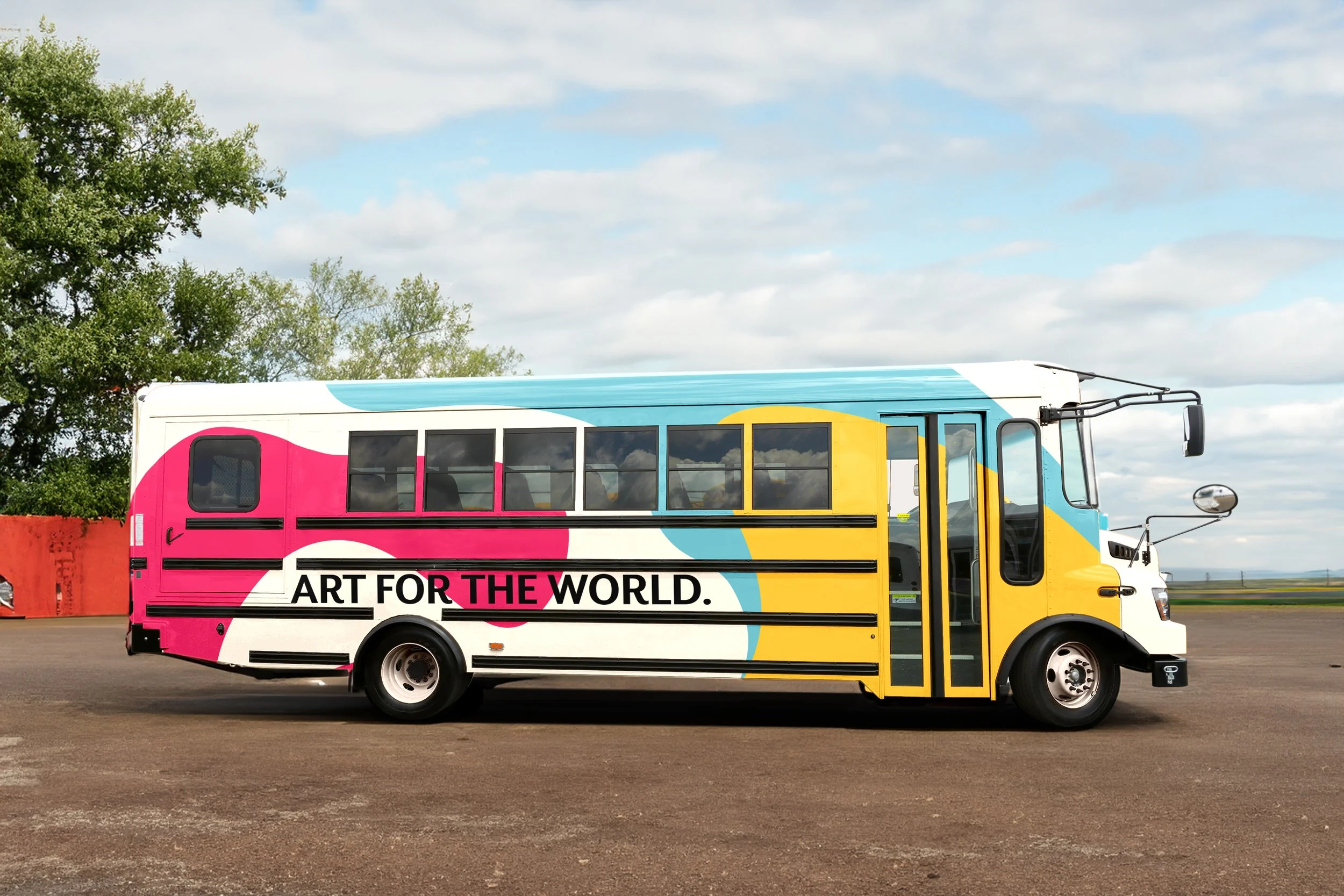
The AFTW Bus
Art for the World’s original mission statement mentioned that they are an organization without walls. I was inspired by this claim but quickly realized that their current branding didn’t reflect it. That's when the idea of transforming the company into a traveling bus sparked in my mind. Here, you can see how I turned the logo and the three primary colors into a paint-splattered bus. The volunteers of Art for the World would travel across the country in these vehicles.


